Policy
Contents
Policy#
This page is going to use the model solution and simulation to estimate policy implications. We will see:
Packages#
import numpy as np
import pandas as pd
import seaborn as sns
from matplotlib import cm
import dhr_functions as dhr
import matplotlib.pyplot as plt
We will set some settings to make our graphs looking good
# PLOTTING SETTINGS
plt.rcParams['figure.dpi'] = 500
plt.rcParams['savefig.dpi'] = 500
sns.set_style('ticks')
sns.despine(left=False, bottom=True)
sns.set_context("paper")
Defining grids#
Set the parameters (M and I) grid and arrays for the policy
n1 = 15
n2 = 20
m = np.linspace(1,20,num = n1)
i = np.linspace(20,100, num = n2)
Now we will loop to create the dataset to plot our policy graphs. This simulates the dataset for the treatment using the grid of policy parameters and get the mean days worked and costs of the program. The cost of the program is calculated by multiplying the income by expected days worked
plots = []
for money in m:
    for incentive in i:
        dic = {}
        fr = dhr.exp_cost_days(M=money, I=incentive)
        exc = fr.loc[fr['Day'] =='Expected Cost']['C'].item()
        dic['I = Pay per day'] = incentive
        dic['M = In money days'] = money
        dic['Expected Cost'] = exc
        dic['Average days'] = dhr.simulate_data(theta = [0.03,4], M=money, I=incentive)[0][0,0]
        plots.append(dic)
plots = pd.DataFrame(plots)
Expected costs#
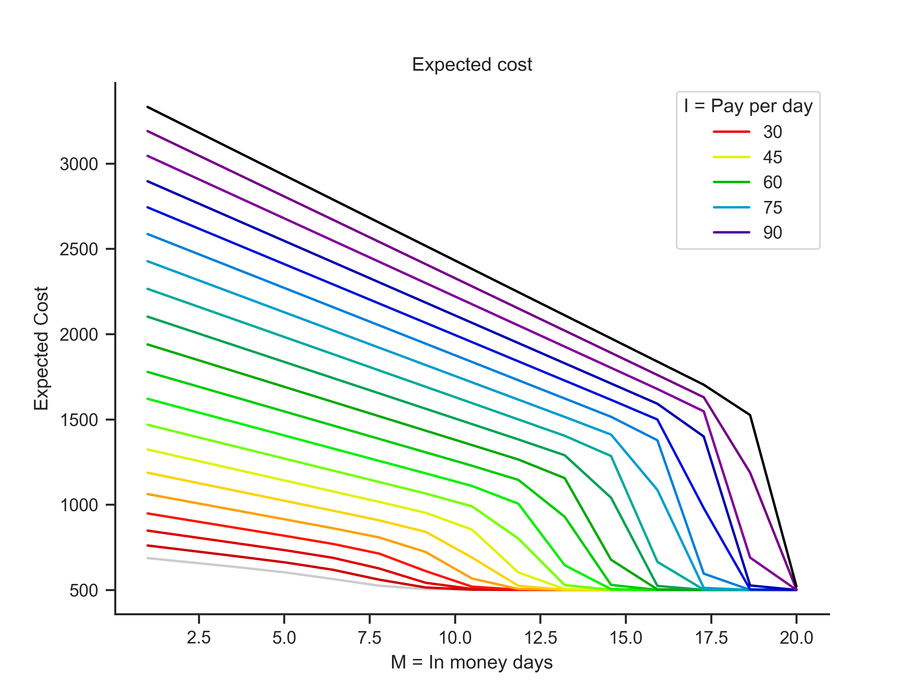
Now we can plot the expected cost and days to be in money together
sns.lineplot(data = plots, x = plots.columns[1], y = plots.columns[2], hue = plots.columns[0], palette= 'nipy_spectral_r' ).set(title = 'Expected cost')
sns.despine(left=False, bottom=False)

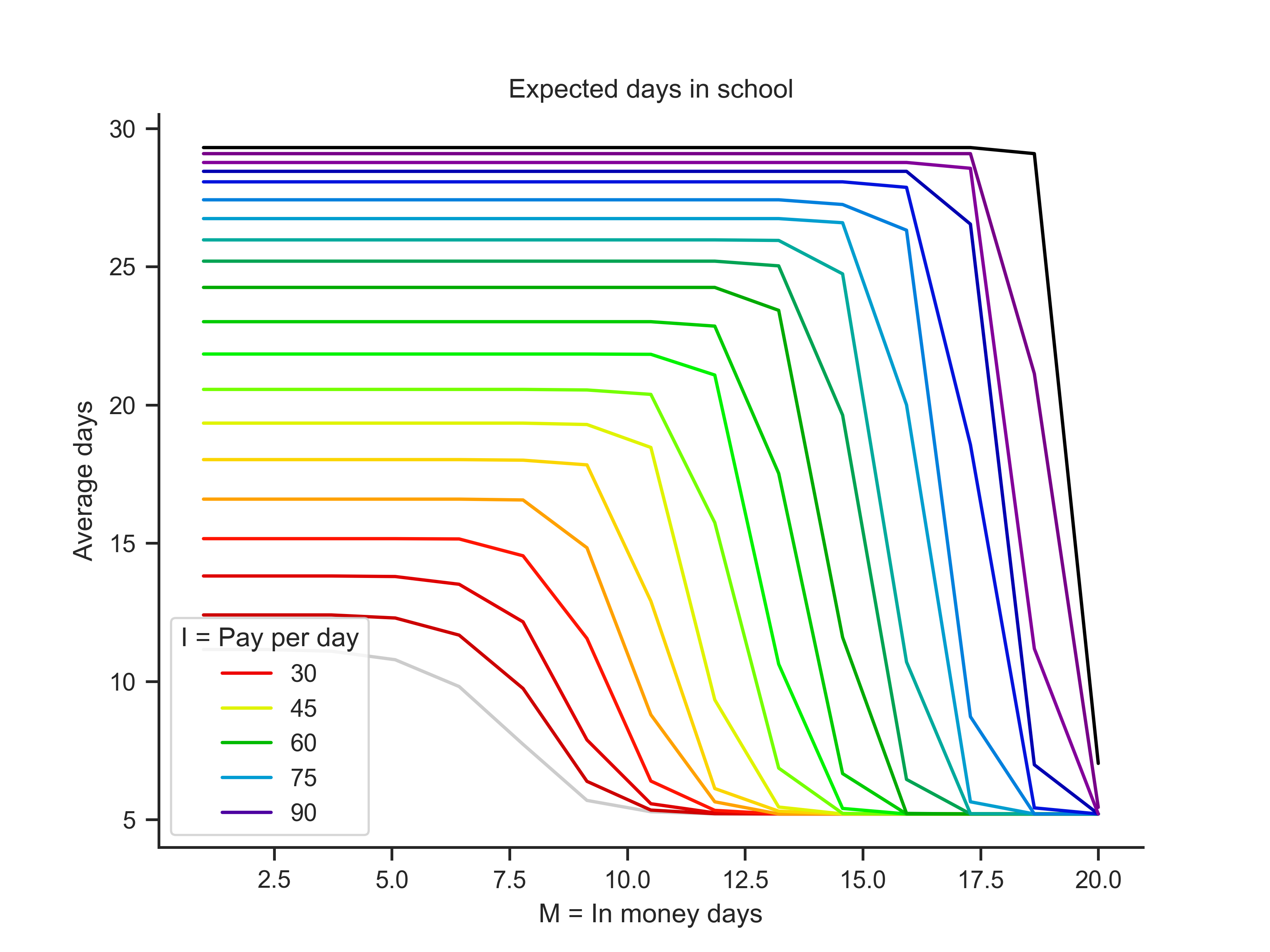
Then, plot expected days worked and days to be in money together
plots = pd.DataFrame(plots)
sns.lineplot(data = plots, x = plots.columns[1], y = plots.columns[3], hue = plots.columns[0], palette= 'nipy_spectral_r' ).set(title = 'Expected days in school')
sns.despine(left=False, bottom=False)

Countour plots#
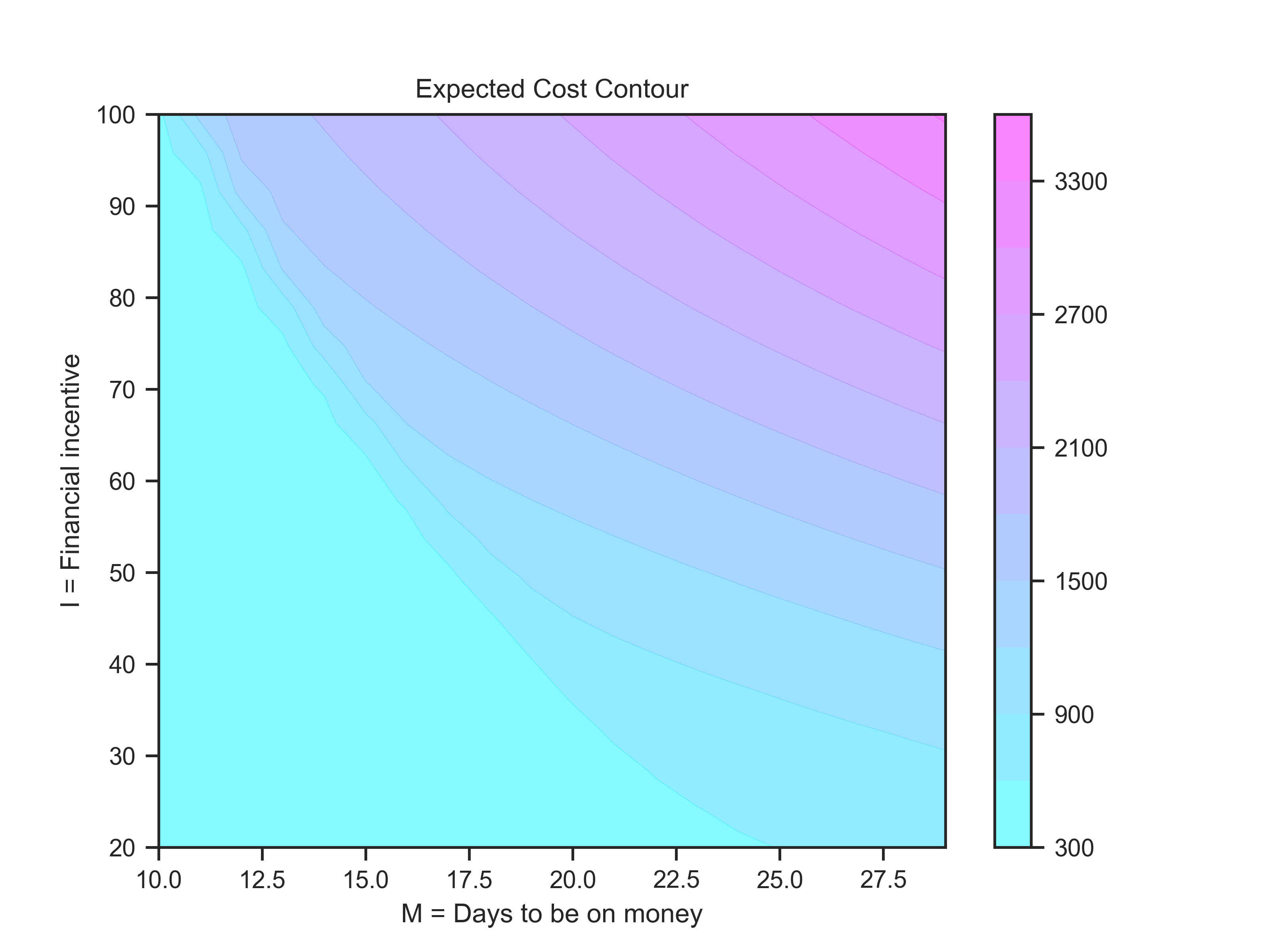
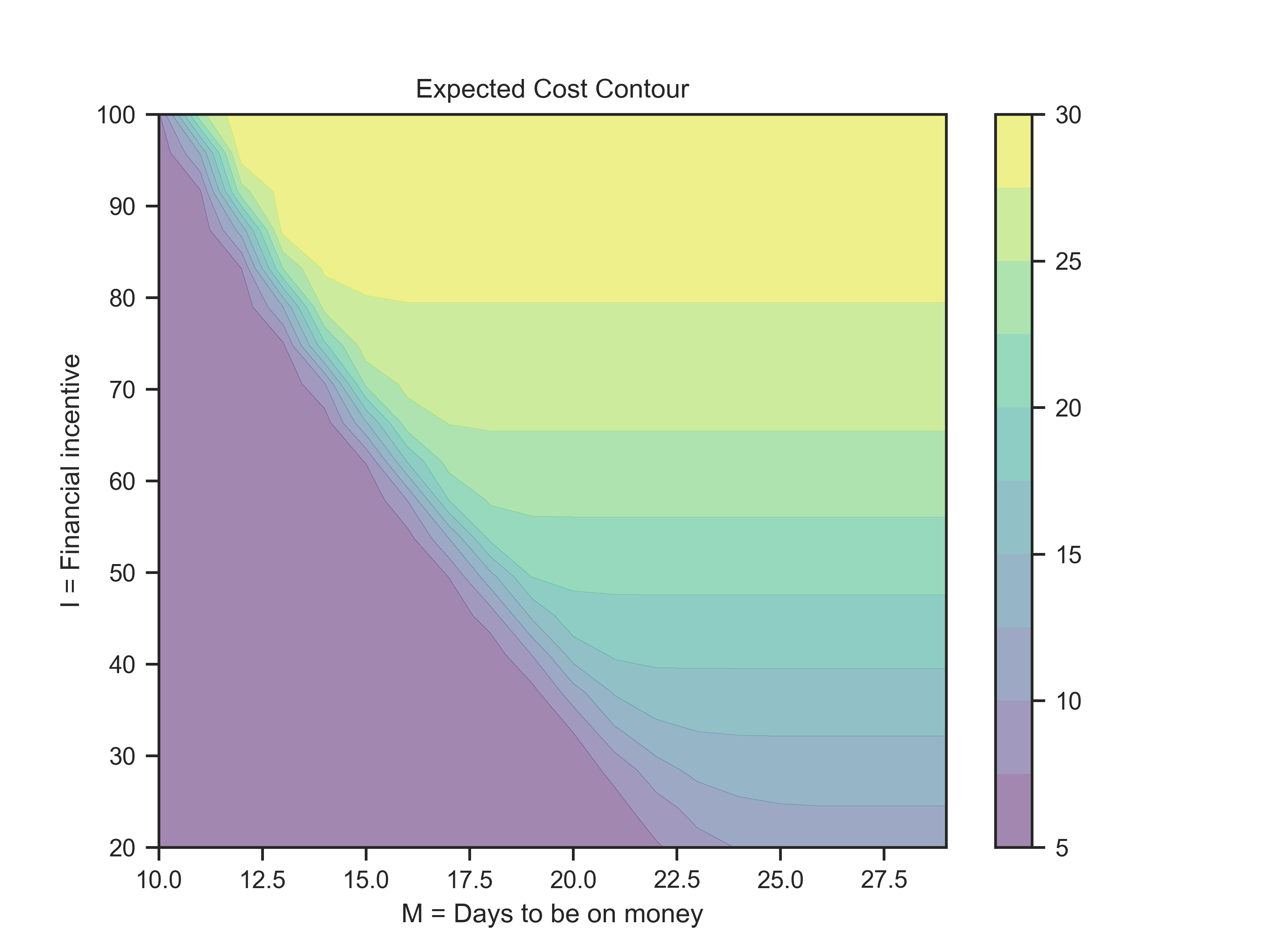
Now we will plot the countour plots. First, I will create the dataset in the proper way to plot it.
Mp, Ip, Cp, Dp = dhr.countour_data(n1 = 20, n2 = 20)
colors = {
    'cost' : cm.cool,
    'days' : cm.viridis
        }
Now, plot the graphs
for var in ['cost','days']:
    if var == 'cost':
        v = Cp
    else:
        v = Dp
    dhr.contours_plots(x = Mp, y = Ip, z = v, var=var, color=colors[var])


